On this page
Website Template Accessibility Checklist: 15 Checks Before You Buy or Build

WebbyCrown Solutions-
August 10, 2026-16 min read
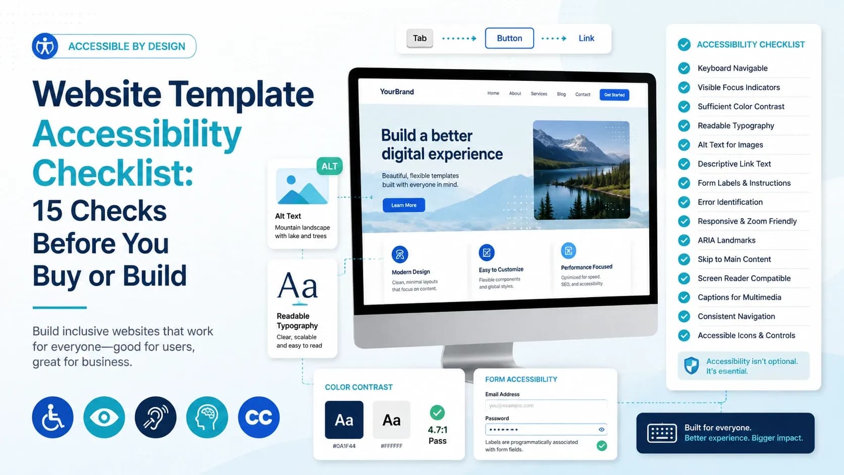
A website template can look polished and still create barriers for people who navigate with a keyboard, use screen readers, zoom text, need stronger contrast, or prefer reduced motion. The safest approach is to treat accessibility as something you verify, not a feature label you simply trust.
This checklist is for buyers, designers, and developers evaluating a website template before launch. It focuses on the accessibility foundation you can inspect in a live demo, coded template, or design file. It is not a legal-compliance certification, and an accessible-looking template does not guarantee that the finished website will conform to WCAG after content, plugins, scripts, and customizations are added.
Quick Answer
To evaluate a website template for accessibility, test it without a mouse, confirm visible keyboard focus, inspect menus and dialogs, check form labels and errors, measure text and UI contrast, verify touch-target size, zoom and reflow the page, review motion behavior, and inspect semantic structure where source code is available. Use automated tools as a first pass, but do not treat a Lighthouse or axe score as proof of WCAG conformance. W3C describes quick checks as an initial review rather than a complete accessibility evaluation.
Key Takeaways
- A template should be evaluated with both automated and manual checks; neither method is sufficient alone.
- Coded templates can be tested for keyboard behavior, semantics, forms, dialogs, and dynamic interactions. A Figma file can only be reviewed for design-stage factors such as contrast, component states, labels, and target sizes.
- WCAG 2.2 Level AA requires at least 4.5:1 contrast for normal text, 3:1 for large text, and 3:1 for many meaningful UI boundaries and states.
- WCAG 2.2 adds a Level AA minimum target-size requirement of 24 by 24 CSS pixels, subject to defined exceptions.
- A high automated accessibility score is useful evidence, but it does not certify that a template or finished website is accessible.
- If an essential interaction cannot be completed with a keyboard or an important control has no usable focus state, treat it as a release blocker rather than a cosmetic issue.
How this article was reviewed: We used current WCAG 2.2 guidance from W3C and reviewed original evidence from three different WebbyTemplate product types: Medicare (HTML), BigMentor (Tailwind CSS), and Starry Heavens (Figma). The examples below report only what the supplied test captures and product pages support; they do not claim full accessibility certification.
15-Point Website Template Accessibility Checklist
| Check | What to Verify Before Launch |
|---|---|
| 1. Keyboard Access | All links, buttons, menus, fields, dialogs, and controls work without a mouse. |
| 2. Visible Focus | You can always see which interactive element currently has keyboard focus. |
| 3. Focus Order | Tab order follows the visual and task sequence without unexpected jumps. |
| 4. Menus and Dialogs | Dropdowns, mega menus, modals, and popups open, close, and return focus predictably. |
| 5. Form Labels | Every input has a meaningful visible label or equivalent accessible name. |
| 6. Errors and Instructions | Errors explain what went wrong and do not rely on color alone. |
| 7. Text Contrast | Normal text generally reaches 4.5:1 and large text 3:1 under WCAG 2.2 AA. |
| 8. Non-Text Contrast | Meaningful borders, icons, focus indicators, and control states are distinguishable at 3:1 where required. |
| 9. Target Size | Pointer targets are at least 24×24 CSS pixels or meet a WCAG exception. |
| 10. Zoom and Reflow | Content remains usable when zoomed and does not require unnecessary two-dimensional scrolling. |
| 11. Motion | Animations do not block use, and motion-sensitive users have an appropriate reduced-motion experience. |
| 12. Images and Icons | Meaningful images can receive useful text alternatives; decorative images can be ignored appropriately. |
| 13. Headings and Landmarks | Coded pages use meaningful headings, page regions, and semantic elements. |
| 14. Dynamic Components | Carousels, accordions, tabs, and status messages expose understandable states and controls. |
| 15. Automated + Manual Review | Automated scans are followed by keyboard, zoom, form, and interaction testing. |
1. First Confirm What You Can Actually Test
Accessibility testing depends on the product format. A coded HTML or Tailwind template can be opened in a browser and tested for real keyboard behavior, focus management, semantic markup, and JavaScript interactions. A Figma template is different: it can reveal whether the design anticipates focus states, readable contrast, error messages, target sizes, and responsive layouts, but it cannot prove that the eventual code will expose correct semantics or work with a screen reader.
If you are still deciding which product format fits your project, start with our guide on how to choose the right website template. This page assumes you already know what type of template you are evaluating and now want to test its accessibility foundation.
Example: Medicare HTML package
The Medicare product is a static HTML template. Its product page lists HTML, CSS, JavaScript, Bootstrap 4, jQuery, Swiper, Magnific Popup, Font Awesome, and Google Fonts, and explicitly states that appointment and contact workflows are front-end interfaces that require a backend or third-party integration for real submissions.
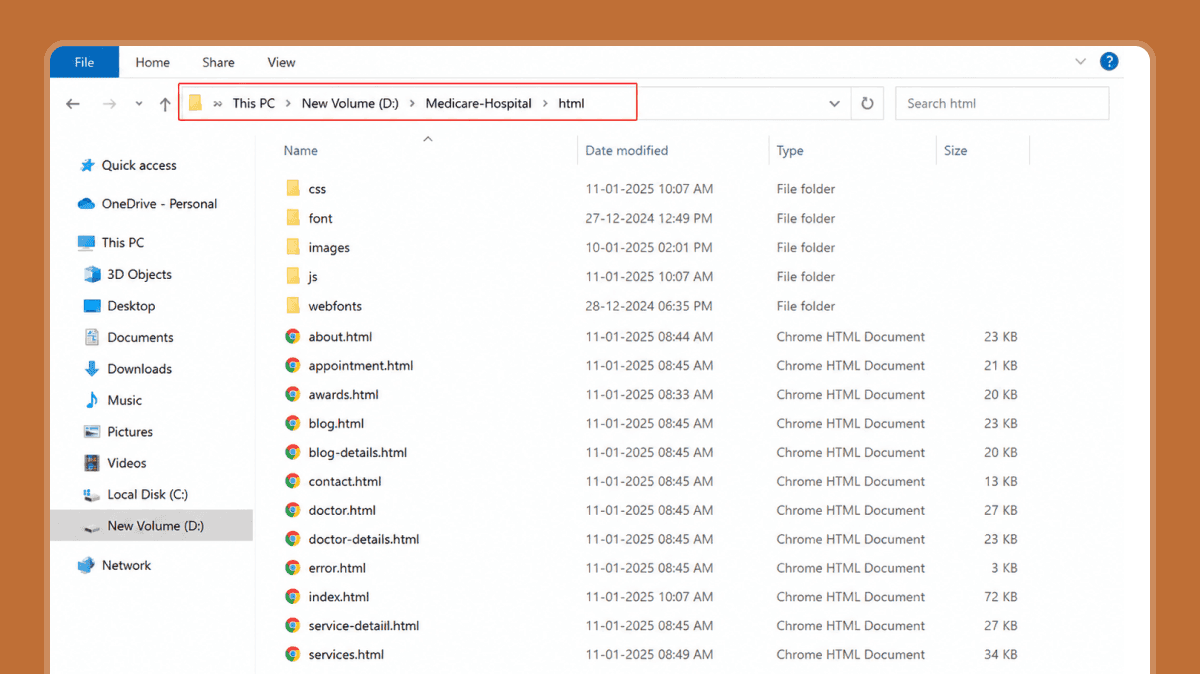
Medicare source-package evidence showing multiple HTML pages and separate CSS, JavaScript, image, font, and webfont folders.
Because the source is coded and browser-runnable, you can test actual tab order, menus, form controls, headings, and JavaScript interactions rather than judging screenshots alone.
2. Test the Entire Page With a Keyboard
Put the mouse aside. Starting at the top of the page, use Tab and Shift+Tab to move through interactive elements. Use Enter and Space where appropriate. For select menus, dialogs, carousels, and custom controls, test the keys users would reasonably expect to work.
- Can you reach every actionable control?
- Can you tell where focus is at every step?
- Does focus move in a logical order?
- Can you open and close menus without getting trapped?
- Can you submit or correct a form without a mouse?
- After closing a dialog, does focus return to a sensible place?
WCAG 2.2 includes keyboard-access requirements and requires visible keyboard focus. WCAG 2.2 also adds a Level AA requirement that focused content not be entirely hidden by author-created content.
Medicare keyboard and form evidence
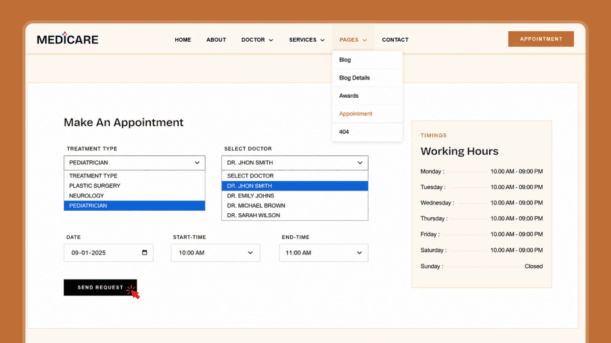
Provided Medicare keyboard-test capture showing the appointment page with navigation and native select controls open during interaction testing.
The supplied capture demonstrates that the appointment page exposes native select controls and an expanded navigation menu during testing. A still image cannot prove the complete focus order or every keyboard transition, so the correct conclusion is not “fully accessible”; it is that keyboard behavior can and should be verified directly in the live implementation.
3. Inspect Menus, Modals, Carousels, and Other Dynamic Components
Dynamic UI is where an attractive template often becomes difficult to use. Mega menus, sliders, popups, tabs, and modals need more than visual styling: they need predictable keyboard behavior, understandable state changes, and focus that does not disappear into the page behind a dialog.
For a modal, verify that the close control is keyboard reachable, Escape works when appropriate, and keyboard focus does not continue into background content while the dialog is open. For menus and carousels, check that controls can be reached, states are visible, and interaction does not depend only on hover.
BigMentor modal evidence
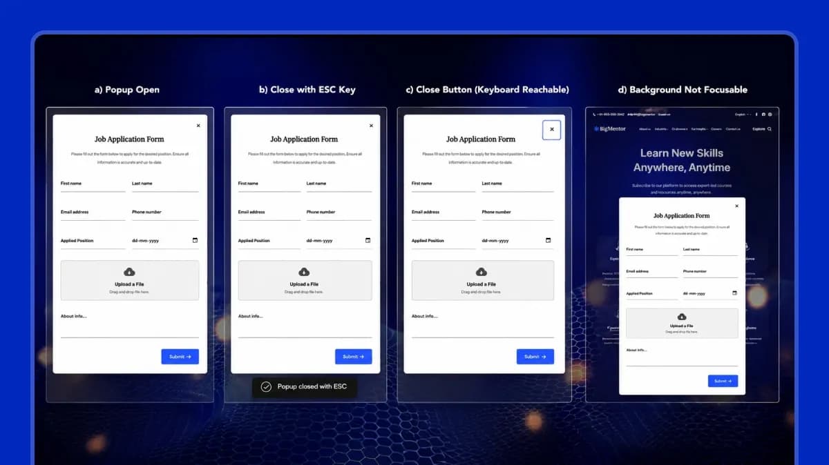
BigMentor modal test capture documenting the open state, Escape-key close behavior, keyboard-reachable close control, and background-focus check.
The supplied BigMentor test evidence records the expected modal behaviors, including an Escape-key close state and a keyboard-reachable close control. These are useful signs of an accessibility-aware implementation, but they still do not replace broader focus-order and assistive-technology testing across the full template.
4. Check Forms, Labels, Instructions, and Error States
Forms should not force users to infer what a field means from placeholder text, position, or color. Check that fields have clear labels, required information is understandable, and validation errors identify the problem in words.
- Labels remain visible after a user starts typing.
- Error text explains what needs to be fixed.
- Error states use text or another cue in addition to color.
- Keyboard users can reach the first invalid field and continue logically.
- Date pickers, file uploads, custom selects, and password controls do not require a pointer-only action.
In a design-only file, you can inspect whether these states have been planned. In code, you must also verify that labels and errors are programmatically associated with the correct controls.
5. Measure Text Contrast and Meaningful UI Contrast
WCAG 2.2 Level AA requires a contrast ratio of at least 4.5:1 for normal text and 3:1 for large text. WCAG 2.2 also requires 3:1 contrast for the visual information needed to identify many UI components and states against adjacent colors.
Do not test only body text. Check secondary text, placeholder-like content, outline buttons, error text, focus indicators, input boundaries, icons, disabled states, text placed on images, and controls that change color on hover or focus.
Starry Heavens contrast evidence
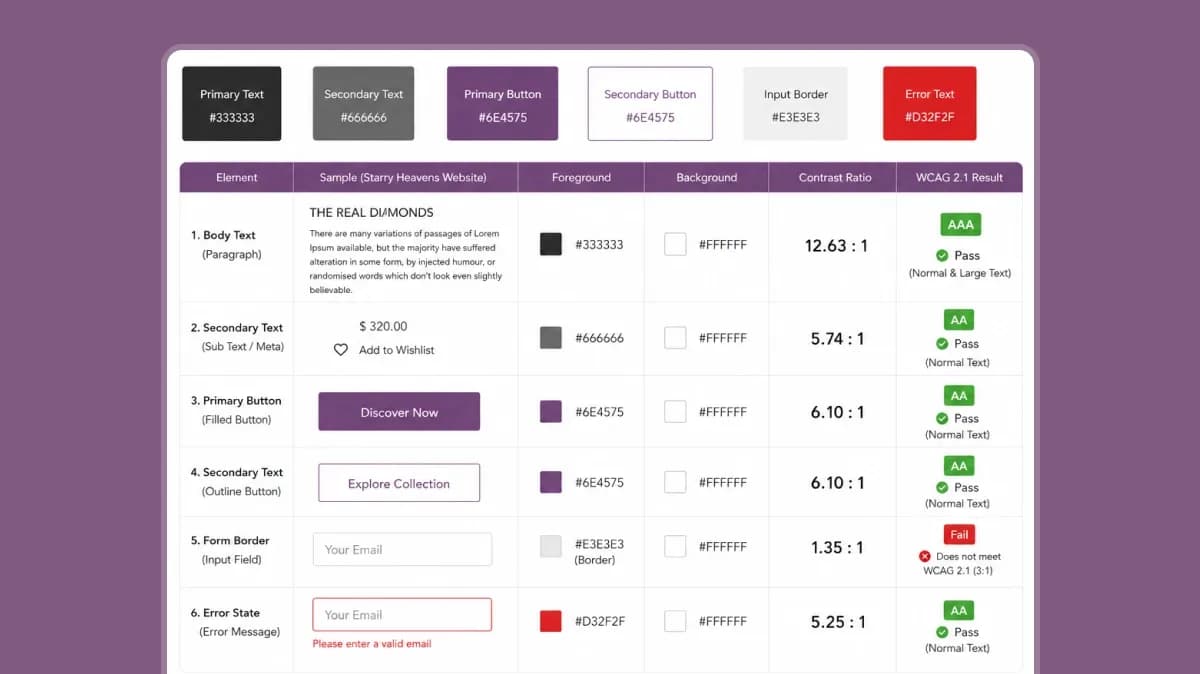
Starry Heavens design-stage contrast worksheet. Body text, secondary text, buttons, and error text pass the recorded thresholds, while the 1.35:1 form-border contrast is flagged as failing the 3:1 non-text contrast target.
The supplied worksheet is labelled WCAG 2.1, but the relevant 3:1 non-text contrast criterion remains part of WCAG 2.2. The most important finding is the input-border result: 1.35:1 against white is below the 3:1 requirement when that boundary is needed to identify the input. That is exactly the kind of issue a template review should surface before development, not hide because other colors pass.
6. Verify Focus, Error, Disabled, and Active States in the Design System
A design file should not hand developers only a default button and expect accessible interaction states to appear later. Review whether components include distinct states for focus, hover, error, disabled, selected, expanded, visited, and other conditions used by the product.
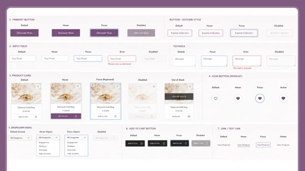
Starry Heavens component-state evidence showing planned default, hover, focus, disabled, error, active, out-of-stock, and visited states across common interface components.
This Starry Heavens evidence is useful at the design-handoff stage because focus and error states are explicitly represented. It still does not prove the eventual code will expose those states correctly to assistive technologies, so developers must implement and retest them in the browser.
7. Check Pointer and Touch Target Size
WCAG 2.2 introduced a Level AA minimum target-size criterion of 24 by 24 CSS pixels, with defined exceptions. This does not mean every button should be exactly 24 pixels; larger targets are often easier to use, especially on mobile.
Measure icon-only controls, close buttons, carousel dots, pagination, checkboxes, menu triggers, and compact text links - not only the main CTA.
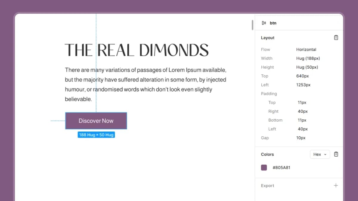
Starry Heavens primary button measured in Figma at 188 × 50 pixels, comfortably above the WCAG 2.2 24 × 24 CSS-pixel minimum target-size threshold for this control.
The 188 × 50 button is a strong design-stage result, but one compliant CTA does not prove that smaller icon buttons, wishlist controls, menu triggers, and carousel navigation also meet the requirement. Test the smallest interactive targets in the system.
8. Test Zoom, Resize, and Reflow
Increase browser zoom and test narrow viewports. The important question is whether users can still read content and complete tasks without content disappearing, overlapping, or forcing unnecessary horizontal scrolling.
- Zoom text and browser content rather than testing only a responsive device emulator.
- Check navigation, tables, cards, forms, dialogs, and sticky elements at enlarged sizes.
- Confirm important content is not clipped behind fixed headers or floating controls.
- Check whether long labels, translated text, and validation messages still fit.
A mobile screenshot can show responsive intent, but zoom and reflow must be tested in an actual rendered implementation.
9. Respect Reduced-Motion Preferences
Animations can improve orientation and visual polish, but they should not make a page difficult for users who are sensitive to motion. If a template includes carousels, AOS effects, parallax, or animated transitions, inspect whether it responds to the user’s reduced-motion preference.
BigMentor reduced-motion evidence
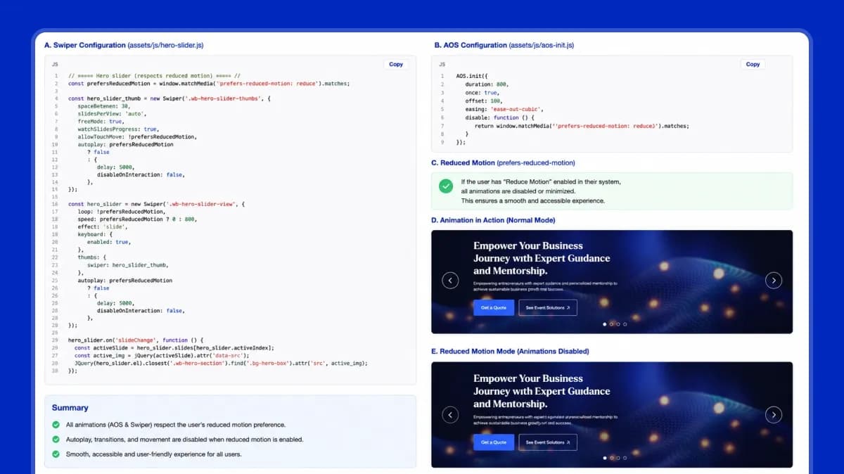
BigMentor evidence showing Swiper and AOS configuration tied to the user’s prefers-reduced-motion setting, with autoplay or animation behavior disabled when reduced motion is requested.
The supplied code capture shows a deliberate reduced-motion path: Swiper behavior and AOS initialization check the user’s `prefers-reduced-motion` setting. This is stronger evidence than simply saying a template “supports accessibility,” because it shows how one concrete user preference is handled in the implementation.
10. Review Headings, Landmarks, Images, and Semantic Structure
For coded templates, inspect the HTML structure as well as the visual hierarchy. A heading that looks large is not necessarily an H1 or H2, and a clickable `div` is not automatically an accessible button.
- Pages have a descriptive title and a sensible main heading.
- Heading levels reflect content structure rather than visual size alone.
- Navigation, main content, footer, and complementary regions use appropriate semantic elements or landmarks.
- Meaningful images can receive useful alt text; decorative images can be ignored by assistive technology.
- Buttons and links use the correct native elements wherever possible.
- Custom widgets expose an appropriate accessible name, role, and state.
These checks cannot be verified from a Figma file alone. They belong in developer implementation and browser testing.
11. Use Automated Accessibility Scores as Evidence, Not Certification
Automated tools are valuable because they quickly catch certain detectable issues. They are also incomplete. W3C’s Easy Checks are explicitly presented as a first review, not a full accessibility evaluation. A single score cannot tell you whether focus order makes sense, whether alternative text is useful, whether a modal is understandable with a screen reader, or whether the overall task can be completed by someone with a disability.
Medicare automated result
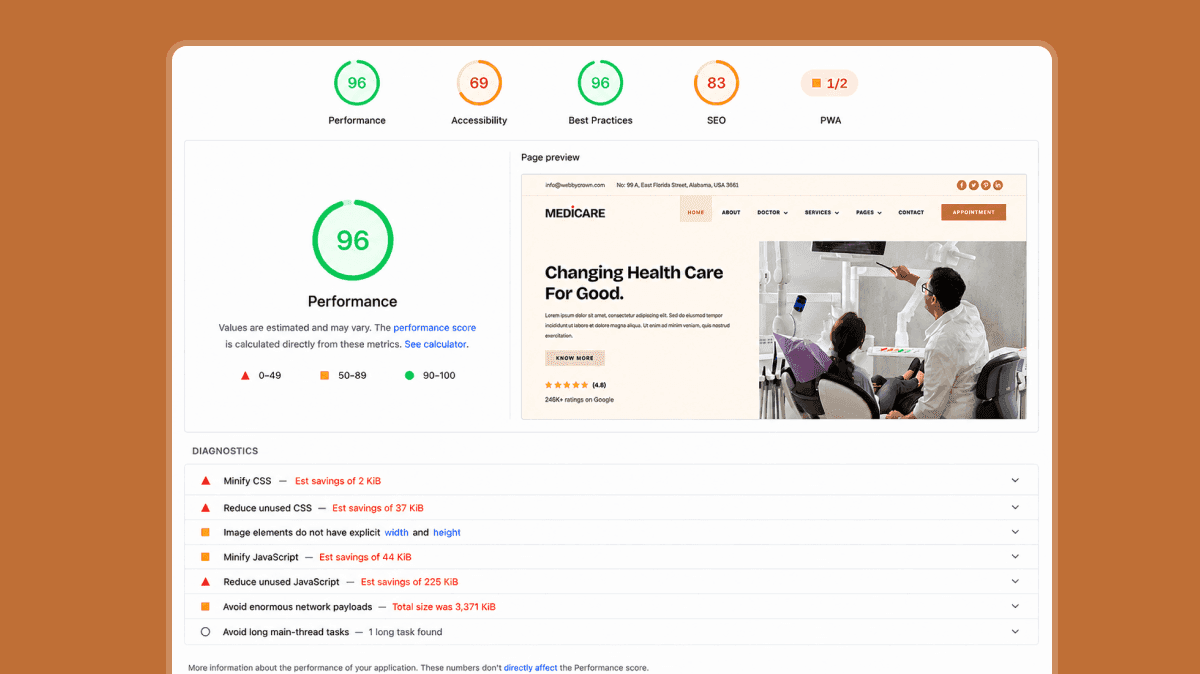
Medicare automated test capture showing a Lighthouse Accessibility score of 69. The score signals unresolved accessibility issues that require inspection and remediation before any accessibility claim should be made.
A score of 69 is not something to hide. It tells the buyer or developer that the template needs additional work. The screenshot provided does not show the individual failing accessibility audits, so the article does not invent them; the correct next step is to open the Accessibility audit details and remediate each verified issue.
BigMentor automated result
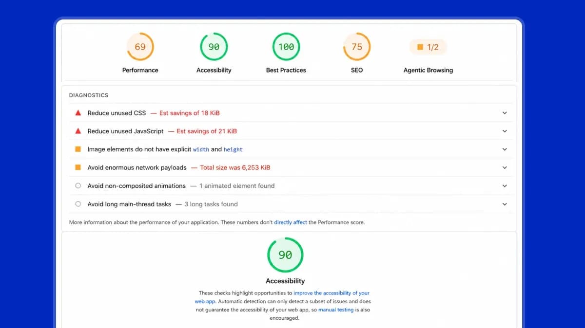
BigMentor automated test capture showing a Lighthouse Accessibility score of 90. This is a stronger automated baseline than Medicare, but it is still not a WCAG conformance certificate.
BigMentor’s 90 score is encouraging when combined with its supplied modal and reduced-motion evidence. It still leaves room for manual checks that automated tools cannot validate. The right editorial conclusion is “stronger tested foundation,” not “fully WCAG compliant.”
What Our Three Template Checks Found
| Template | Evidence Reviewed | What the Evidence Supports | Decision |
|---|---|---|---|
| Medicare – HTML | Source folders, appointment/keyboard capture, Lighthouse Accessibility score of 69 | Browser-testable HTML structure and form UI, but the automated audit indicates unresolved accessibility issues. | Conditional — remediate identified issues and retest. |
| BigMentor – Tailwind CSS | Lighthouse Accessibility score of 90, modal behavior evidence, reduced-motion implementation | Stronger tested baseline with explicit reduced-motion support and documented keyboard behavior for modal dialogs. | Conditional / Strong Foundation — complete a full manual accessibility audit before release. |
| Starry Heavens – Figma | Component states, contrast worksheet, 188×50 target measurement | Well-prepared design states and compliant target sizing; however, the input border contrast of 1.35:1 requires redesign. Semantic structure and keyboard behavior cannot be verified until the design is implemented in code. | Design-Stage Conditional — fix contrast issues and validate the implementation after development. |
These verdicts are deliberately conservative. None of the three examples is being certified as WCAG conformant. The purpose of the comparison is to show how a buyer or developer can use real evidence to identify strengths, limitations, and next actions.
Pass, Conditional Pass, or Reject: A Practical Buyer Decision
| Decision | Use It When |
|---|---|
| Pass to Development | The design or template has no known blocking issues in the checks you can perform, and the remaining items are scheduled for implementation-level verification. |
| Conditional Pass | The template is usable as a foundation, but specific accessibility issues must be remediated and retested before launch. |
| Reject or Replace | Essential interactions are inaccessible, the product cannot be reasonably remediated, or the seller makes accessibility claims without evidence while critical barriers remain. |
For most marketplace products, “conditional pass” is the realistic result. Templates are starting points. Accessibility still depends on implementation, content, integrations, and ongoing editorial choices.
Buyer and Developer Handoff Checklist
- Record the template version and date tested.
- Save automated audit screenshots and the detailed issue list.
- Document keyboard blockers and focus-management issues.
- Record contrast measurements for text, controls, focus indicators, and error states.
- Identify design-only checks that still require implementation validation.
- List components that need screen-reader testing after development.
- Retest after adding real content, third-party scripts, forms, and plugins.
- Do not publish an “accessible” or “WCAG compliant” claim unless the finished website has been evaluated to support that claim.
For broader usability principles that support this work, see WebbyTemplate’s guide to UX design principles. For general template-selection criteria beyond accessibility, use the website template selection guide.
FAQs
Q1.
Can a website template be WCAG compliant by itself?
Q2.
Is a Lighthouse accessibility score of 100 enough?
Q3.
What is the minimum text contrast for WCAG 2.2 AA?
Q4.
What is the WCAG 2.2 minimum touch-target size?
Q5.
Can I test accessibility in Figma?
Q6.
Should I reject a template with accessibility issues?
Final Recommendation
Do not buy or launch a template because an automated tool shows a green score or a product page says “accessible.” Ask for evidence and perform the checks yourself. The strongest template is not the one with the most accessibility marketing; it is the one whose important interactions can be tested, whose limitations are visible, and whose design and code can be improved without rebuilding the project.
For your next project, browse WebbyTemplate templates and themes, then evaluate shortlisted products with this checklist before you commit to implementation.
Sources and Standards Used
- W3C — Web Content Accessibility Guidelines (WCAG) 2.2
- W3C WAI — Easy Checks: A First Review of Web Accessibility
- W3C WAI — What’s New in WCAG 2.2
- WebbyTemplate — Medicare HTML Template
- WebbyTemplate — BigMentor TailwindCSS Template
- WebbyTemplate — Starry Heavens Figma Template