On this page
How to Choose a WooCommerce Template That Converts
WebbyCrown
January 9, 2026 • 6 min read
Choosing a WooCommerce template should be the easy part. Pick something that looks good, install it, upload products, and start selling. In reality, the wrong template can quietly sabotage conversion with slow pages, clunky checkout UX, awkward mobile behaviour, and small design decisions that make shoppers hesitate.
The best WooCommerce template isn’t the prettiest demo. It’s the one that stays fast once you add your real plugin stack, keeps checkout calm and predictable, and makes product pages feel trustworthy without shouting for attention.
If you’re aiming for a high-converting checkout and you’re already juggling multiple plugins, it can be faster to involve a WooCommerce development agency early than to debug issues after sales start dropping.
Start with what “conversion” actually means
Conversion isn’t one moment. It’s a chain of small decisions: does this site feel legitimate, can I find what I need, does the product page answer my questions, and will checkout be painless? Templates influence all of that, even when they look similar on the surface.
When a template converts well, customers move through the journey without friction. They don’t get distracted, confused, or slowed down. The page loads quickly, the layout guides attention naturally, and checkout feels like a simple final step, not a technical hurdle.
The demo is not the product
Most template demos are running in a perfect environment. They’re often lightly loaded, highly cached, and not weighed down by the plugins you’ll eventually need for payments, shipping logic, subscriptions, marketing tags, reviews, and analytics.
That’s why a theme that looks “premium” can still perform badly once it meets reality. The smarter approach is to judge templates by how they behave under pressure, not how they look in a polished demo video.
Before you fall in love with a design, ask:
- Will this theme stay fast when I add my plugins and real product images?
- Is the mobile layout genuinely usable, or just “responsive” on paper?
- Does checkout look calm and consistent, or busy and bolted-on?
- Can I customise layouts without installing five extra page builders?
Speed is a conversion feature, not a technical detail
Speed affects everything: bounce rate, add-to-cart rate, and how patient people are at checkout. A slow product page forces shoppers to wait to see images, scroll jankily, or re-check details. That creates doubt, and doubt kills purchases.
The template plays a bigger role in speed than most people expect. Heavy scripts, oversized sliders, animations, and bloated builders all add weight. Even if you optimise later, starting with a lightweight theme makes every improvement easier.
Practical checks you can do quickly:
- Open the demo on your phone using mobile data, not Wi-Fi.
- Click between a product page, cart, and checkout and watch how it feels.
- Look for “jumping” layouts as content loads, especially images and price blocks.
- Avoid themes that rely on giant hero sliders or multiple animated sections above the fold.
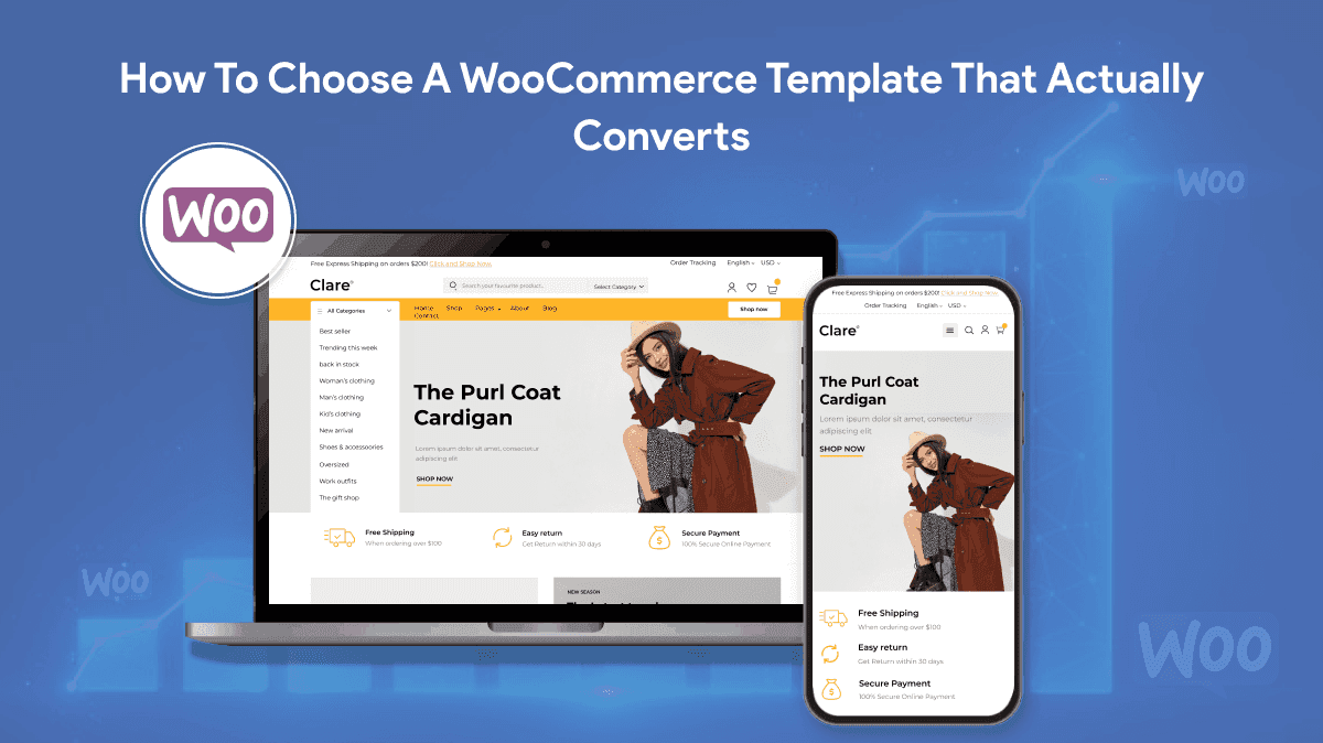
Mobile product pages: make buying feel effortless
On mobile, people skim, scan, and decide quickly. A converting product template makes the essentials obvious: title, price, delivery expectation, variants, and the add-to-cart button. It also makes reassurance easy to find: returns, reviews, and trust signals.
A common template mistake is burying the add-to-cart button, spreading key details across awkward tabs, or forcing endless scrolling before a customer can confidently buy. Another is making variant selection fiddly, especially for size and colour.
On mobile, the best templates usually have:
- A clear add-to-cart area that stays close to key info.
- Simple variant selectors that are easy to tap.
- Readable typography and spacing (no tiny grey text).
- Reviews that are visible and believable, not hidden in a collapsed tab forever.
Checkout design: calm beats clever
Checkout is not the place to impress people with design tricks. It’s the place to reduce anxiety. The best converting checkout templates are boring in the right way: clean layout, clear steps, minimal distractions, and a reassuring tone.
Templates can damage checkout conversion by introducing unnecessary fields, cluttered layouts, or multiple competing “express” buttons that create decision friction. You want a clear hierarchy: primary payment option, one trusted alternative, and everything presented consistently.
Green flags in a WooCommerce checkout layout:
- Few fields and sensible defaults.
- Clear validation and error messaging.
- No distracting sidebars stuffed with unrelated content.
- A consistent look that matches the rest of the site (no sudden “different” checkout).
Compatibility matters more than features
A feature-rich theme can still be a bad choice if it clashes with your core plugins. The moment you add subscriptions, deposits, complex shipping rules, multilingual, or multi-currency, weak templates start showing cracks.
Even if everything “works”, poor compatibility often shows up as weird edge cases: payment methods not displaying properly, checkout blocks breaking, cart totals behaving oddly, or performance dropping sharply.
Make a list of what you’ll actually run:
- Payment gateways and wallets
- Shipping logic (zones, rates, carrier integrations)
- Subscriptions or memberships
- Reviews, bundles, or product add-ons
- Marketing and tracking (email, pixels, analytics)
Then choose a theme that’s known to behave well with WooCommerce’s current checkout approach and doesn’t force you into a fragile page-builder maze.
Design details that increase trust (without looking salesy)
Trust isn’t just badges and logos. It’s how the template communicates certainty. Clear pricing. Clear delivery expectations. Clear returns. Clear stock messaging. Clean typography. Consistent spacing. A customer should feel like the store is well-run.
Templates that convert well usually do the basics exceptionally well. They don’t hide important information. They don’t rely on gimmicks. They create a quiet confidence that makes purchase feel safe.
Small trust wins worth prioritising:
- Delivery and returns info near the buy decision.
- Product imagery that loads quickly and can be zoomed easily.
- Review layouts that look genuine and are easy to browse.
- Contact and support routes that feel real, not buried.
How to shortlist templates without wasting weeks
The fastest way to choose well is to narrow to a small shortlist and test them against your real needs. Most stores don’t need endless theme shopping. They need a stable foundation that won’t fight them later.
A simple shortlist process:
- Pick three themes that are WooCommerce-first, not “blog theme with ecommerce support”.
- Test the demos on mobile and desktop, focusing on speed and usability.
- Check how product pages handle variants, reviews, and delivery information.
- Review documentation and update history to confirm ongoing maintenance.
- Validate that the theme supports your preferred checkout approach (classic or blocks) cleanly.
Choose the theme you can grow with
A template is not just a look. It’s infrastructure. The best theme choice is the one that makes future changes easier: adding products, improving conversion, adjusting layouts, and evolving checkout without fragile hacks.
If you choose a lightweight, WooCommerce-focused template with a clean product page and calm checkout, you’ll usually get better performance, fewer conflicts, and a smoother buying experience. And that’s what converts: not the fanciest demo, but the least friction between “I want it” and “I bought it”.

WebbyCrown's Insight
No headings found in this content.