On this page
The Hidden Psychology Behind High-Converting Website Templates
WebbyCrown Solutions-
June 5, 2026- 5 min read
UX/UI designer Keyur Vadhadia was tasked with designing a website for a data analytics company. The client request: Make it convert.
To any outsider, it sounds simple enough. But entrusting someone to create a high-converting website takes more than bells and whistles. There’s a psychology behind it.
Vadhadia learned that crafting an engaging website template comes down to several things. By using psychological principles, he took a standard website from meh to something his client could be proud of.
High-converting website templates have a few things in common. Today, we’re going to explain what they are.
The 3-Second Rule
As a brand owner, you have to entice a visitor in the first three seconds of landing on a page. Now, that’s virtually impossible if you have zero insights into your target audience.
Most designers use the 3-Second Rule. It’s grounded in the assumption that visitors form a first impression and decide whether to stay within three seconds of landing.
When using website templates, it’s important to choose designs that instantly convey your brand’s value. It must guide the eye and load quickly.
Simple is Always Better
Remember when Adobe Flash infiltrated almost every website? The now-retired (thank goodness) plugin was once used to create interactive web content and animations. For a while, online users were into it until Flash fatigue set in.
Our brains are overstimulated enough. Information overload and doom scrolling add to the cacophony. We crave peace, not mental exertion. That’s why templates convert best when they are effortless. No noise. No effort. No continuous scrolling.
Complex layouts cause decision paralysis, argue website design experts. Templates that use standard navigation, scannable text, and familiar structures
Guiding Visitors to Conversion Action
The objective is always the same: coaxing visitors to take action. To achieve this, you must remove all distractions from your site’s layout.
A great example of this is Ice Cartel’s layout. It naturally encourages users to browse and purchase. Bold visuals and generous spacing reflect the target audience’s desires.
“Your headline and supporting text should leave no room for confusion. Be specific and use language your ideal client understands.” - Joanna Moss, website designer.
And that visual flow makes all the difference, including the placement of your text.
The Finer Details
A visually styled call-to-action (CAT) button is one part of the process. The other is your checkout system.
By partnering with the right eCommerce payment provider, you reduce friction once consumers choose to pay, says PayPro Global. The right payment platform can act as your Merchant of Record (MoR), managing the entire sales and tax infrastructure.
If you sell internationally, consider implementing a gateway that deals with taxes, compliance, payment issues, and fraud risks.
Don’t sleep on this. It might seem minor at first, but implementing the right checkout solution from the start will save you in the long run.
Hick’s Law
Named after British psychologist William Edmund Hick and his U.S. associate Ray Hyman, Hick’s Law is usually associated with UX design.
The law states that the more choices you have, the longer it takes to make a decision, resulting in decision paralysis.
In other words, users besieged by too many choices have to take time to interpret and decide. This gives them work they don’t want. When your user is overwhelmed, they won’t buy.
Offer them clarity and focus.
Typography
Never underestimate the power of typography. Thinking it’s all just aesthetics is where many people go wrong.
A paper published in Cureus revealed the effect of font type on working memory and attention. It concluded that serif fonts may help capture attention. General Sans is scientifically optimized for digital reading. Slightly condensed, the letterforms allow more content per line without appearing cramped.
A clear visual hierarchy is also crucial. It steers users through the content journey. Large, impactful headlines create interest. Carefully sized body text maintains readability.
FAQs
Q1.
What makes a website template high-converting?
A high-converting template combines clear messaging, fast load times, intuitive navigation, and strong visual hierarchy.
Q2.
Why is simplicity important in web design?
Q3.
How does psychology influence website conversions?
Q4.
How do payment systems impact conversions?
Key Stats on High-Converting Website Design
| Use Case | Better Choice | Example |
|---|---|---|
| T-shirt size | Variation | Small, Medium, Large |
| Custom name print | Add-on | Text field |
| Shoe color | Variation | Black, Brown, White |
| Gift wrapping | Add-on | Checkbox |
| Ring metal type | Variation or configurator | Gold, Silver, Platinum |
| Upload artwork | Add-on | File upload |
| Pizza toppings | Add-on | Checkboxes |
| Bundle builder | Advanced add-on or configurator | Choose accessories |
When a Website Template Converts
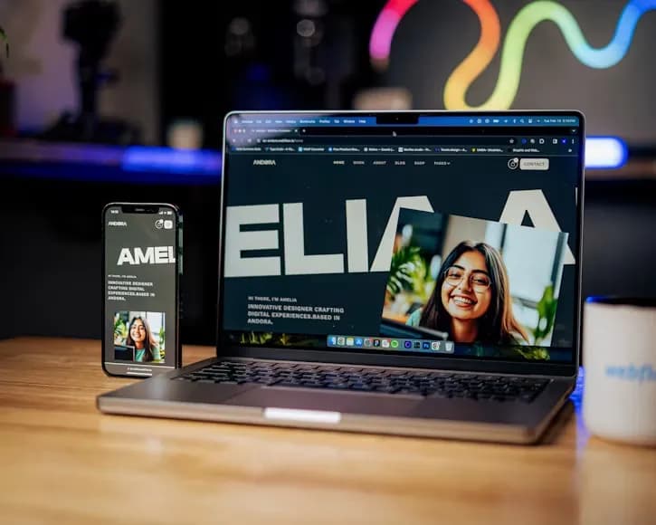
While researching new website templates, you’ll come across pretty ones, colorful ones, and all sorts.
It will be hard to choose, but choose you must. Don’t forget the psychology behind what makes a template convert. You want an engaged audience to click on that “buy now” button.
Make it happen by starting with the right tools and template.