On this page
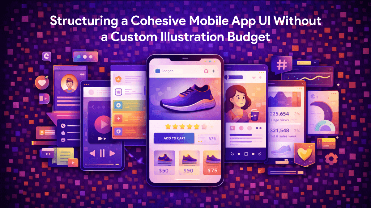
Structuring a Cohesive Mobile App UI Without a Custom Illustration Budget
WebbyCrown Solutions-
April 14, 2026-6 min read
Coding mobile app logic demands intense focus. Populating that same interface with appropriate visual feedback requires an entirely different skill set. Developers often hit a frustrating wall right before launch. Empty states suddenly dominate the entire user experience. Zero-data dashboards, disconnected server warnings, and fresh onboarding carousels desperately need visual anchors. Text alone makes your new application feel unfinished. Hiring a dedicated agency costs thousands of dollars. Weeks of painful delay usually follow.
Independent creators face a massive dilemma. Finding pre-made assets matching a proprietary brand system takes hours of searching. A chaotic patchwork of varied stock images ruins user trust. Icons8 built Ouch to solve that exact friction point. You gain access to a highly categorized library of vector and 3D graphics built purely for strict interface consistency.
The Reality of Interface Dead Ends
Designing for failure matters just as much as mapping out success. Late Thursday evening beta pushes reveal painful truths. Kieran, lead developer on a new marathon pacing app, had his core tracking logic running flawlessly. User testing uncovered an unexpected problem. Testers hit totally blank screens when they lacked logged workouts. Dropped GPS signals yielded nothing but empty white spaces. Missing visual communication broke the entire app experience completely.
Kieran needed fourteen distinct visuals right away. "Sync Successful" confirmations required a specific graphic. "No Bluetooth Devices Found" needed another distinct asset. He couldn't afford an expensive freelance illustrator. Drawing them manually simply wasn't a realistic option either. Pre-existing catalogs featuring identical line weights, shading rules, and color palettes were his only hope.
Single-source graphic libraries change everything for solo founders. Suddenly, professional UI states become accessible.
Sourcing an Onboarding Sequence
Onboarding flows demand three or four graphics from the exact same immediate family. Mixing a flat geometric shape on screen one with a detailed 3D isometric graphic on screen two is a massive mistake. Premium applications never mix clashing aesthetics. Consistency builds immediate user trust.
Ouch breaks its massive catalog down into 101 distinct illustration styles. Developers lock into a single aesthetic parameter instead of browsing the entire globe of images. Minimal monochrome styles pop beautifully against a highly colorful native fitness interface. Select your chosen style bucket first. Run localized searches for specific tags like "running," "smartphone," and "success" afterward.
Finding these exact assets takes mere minutes. Browse the dedicated illustrations repository to locate a complete sequence of matching graphics. Grab an inviting image for the welcome screen. Snag another professional vector for the permissions request. Pull a third illustration for the final setup confirmation. One single design team crafted them all under strict visual guidelines.
Assembling Custom Error States
Pre-made scenes rarely cover hyper-specific edge cases right out of the box. Stock libraries usually offer generic "server down" images featuring broken desktop computers. Mobile fitness trackers need disconnected smartwatches or dropped chest-strap heart rate monitors.
Static images hold developers back. Ouch bypasses that frustrating limitation by offering layered, searchable objects. Flattened JPEGs severely restrict your creativity. Individual vector components make up every single asset here. Take any base graphic directly into Mega Creator, their free online companion editor. Delete that generic laptop from a cartoon character's hand. Swap in specific sporting equipment from the dedicated "Objects" or "Sport" categories.
Component-level editing completely solves tricky brand coloring. Fitness applications frequently rely on highly specific neon greens for primary call-to-action buttons. Recolor illustration accents right inside the web editor. Match your specific project hex codes perfectly before ever hitting the export button.
Weighing the Stock Visual Market
Pre-made interface graphics flood the modern digital market. Different tools serve totally different production workflows.
- unDraw: Tech-focused SVG graphics live here for absolutely free. Rapid prototyping works perfectly with these lightweight assets. Massive overexposure remains the main catch. Thousands of lazy startups use those exact same characters because they are so accessible. Sticking with unDraw typically gives your brand new app a cheap, recognizable template vibe.
- Blush: Customization and character swapping shine brilliantly on this platform. Quirky, distinct artist styles dominate the entire catalog. Editorial blogs and creative portfolios thrive on these expressive assets. Clean, clinical utility applications suffer from heavily stylized artwork. Highly stylized vectors often feel incredibly distracting.
- Freepik: Asset volume here is absolutely staggering. Strict curation just doesn't exist. Finding a brilliant standalone graphic for your 404 page is very easy. Locating a matching "add to cart" illustration by that same artist with identical stroke widths is nearly impossible.
Ouch functions exactly like an internal corporate design system. Strict visual guidelines enforce tight consistency across 28,000 business and 23,000 technology assets. Building a coherent empty state system finally becomes possible without paying a massive agency invoice.
When Pre-Made Libraries Fall Short
Stock libraries have very strict boundaries. Novel, proprietary metaphors demand custom illustration work. Complex AI data synchronization concepts unique to your specific algorithm won't exist in any pre-made catalog. Standard interface concepts like user logins, server errors, and empty shopping carts are easy to find. Explaining highly complex original intellectual property requires hiring a real human illustrator.
Licensing models also dictate your usage rules. Free tiers offer transparent PNG downloads. Icons8 strictly mandates a visible attribution link for any unpaid usage. External attribution links look incredibly unprofessional buried inside native mobile navigation menus. Commercial applications must definitely upgrade to a paid professional plan.
Subscriptions provide those crisp SVGs needed for native mobile scaling. Attribution requirements vanish immediately upon payment. Physical merchandise printing requires negotiating an entirely separate commercial licensing agreement.
Extracting Value From the Catalog
Cohesive interfaces require strict visual discipline. Working directly with a massive asset library truly tests your restraint.
- Enforce strict style isolation: Pick one single style from those 101 options. Never deviate from it. Mixing a sketchy pencil look with a shiny 3D clay model quickly destroys visual trust.
- Install the desktop integration: Pichon lets you bypass the cluttered web browser entirely. Drag transparent PNGs or vector SVGs directly from the application window. Drop them right into Figma, Android Studio, or Xcode.
- Animate your formats: Static images work perfectly fine for basic error states. Onboarding screens desperately need dynamic movement. Export final visual sequences as Lottie JSON or Rive files. Lightweight animation files render natively on mobile devices. Boring success screens immediately transform into dynamic, highly polished interactions.
- Roll over unused assets: Paid plans let unused monthly downloads roll over to the next billing period. Grab your core UI states first. Reserve remaining visual credits for upcoming marketing materials. Future app feature updates will maintain perfect brand consistency.