On this page
Boost Your Workflow with Figma Components
WebbyCrown Solutions-
February 20, 2026-11 min read

Figma is a powerful design tool that has transformed the way designers approach creating and managing UI components. Unlike other design tools, Figma operates entirely in the cloud, allowing designers and teams to collaborate in real time from anywhere. Its intuitive interface makes it easy to create, organize, and manage master components, which can be reused and updated across multiple projects. This means you can build a robust library of components and instantly apply changes throughout your designs, streamlining your entire design process.
With Figma, designers can quickly access a wide range of pre-made UI components, or create their own to suit the specific needs of each project. The ability to manage components efficiently not only saves time but also ensures consistency and quality across all your projects. Whether you’re working solo or as part of a larger team, Figma’s flexible system supports every stage of the design process, making it the go-to choose for modern designers looking to create, manage, and scale their design work with ease.
What Are Figma Components?
Figma components are reusable UI elements that help you maintain consistency across your design projects. Figma components are reusable objects in design that can range from simple buttons to complex navigation headers, serving as foundational building blocks for consistent UI elements like buttons, icons, and navigation headers. Instead of designing the same button, card, or navbar repeatedly, you create it once and reuse it everywhere.
When you update the master components, all related components update automatically. This saves time, reduces mistakes, and ensures your design styles remain consistent across multiple projects.
In simple words: Create once → Reuse everywhere → Update instantly.
Why Figma Components Are Essential for Modern Designers

Designers today use multiple design tools, but Figma stands out because of its component-based workflow. Using curated resources like UI kits and following best practices for designing, organizing, and maintaining Figma components can further enhance the efficiency and consistency of your workflow. Here’s why figma components are essential:
1. Speed Up Your Design Process
When you build UI components like buttons, input fields, cards, and modals, these components act as blocks—pre-designed, reusable elements that can be quickly adapted for different projects. You don’t have to redesign them for every next project. Just drag and drop from your library.
2. Maintain Consistency
Using color styles, text styles, and maintaining consistent shape for UI components ensures that your typography, branding, and visual harmony stay uniform across all design projects.
3. Easy Updates with Master Components
When you edit master components, all related components update automatically. This is especially helpful when handling multiple projects or large-scale design systems.
4. Better Team Collaboration
Teams can share a centralized design system, making it easy for users—designers and developers—to find and use components. This creates a solid foundation for designers and developers to work together smoothly.
Components can be published in a library for use across different files and projects, enhancing team collaboration.
Types of Components in Figma

Understanding different types of components will help you organize components more effectively. Creating a collection or library of components streamlines access and management, making it easier to maintain consistency across your designs.
Figma libraries can also be organized into multiple documents to make it easier for users to find the components they need.
1. Master Components
Master components are the original source of a component. When you make changes here, every instance updates automatically.
Example:
- Button (Primary)
- Navbar
- Card layout
These are your base ui components.
2. Instances (Related Components)
Instances are copies of master components. They are also called related components because they are linked to the original master.
You can modify content like text override without breaking the main structure.
Example:
- Change button label from “Login” to “Sign Up”
- Update card title text
- Modify image inside a card
Building a Solid Foundation with a Design System
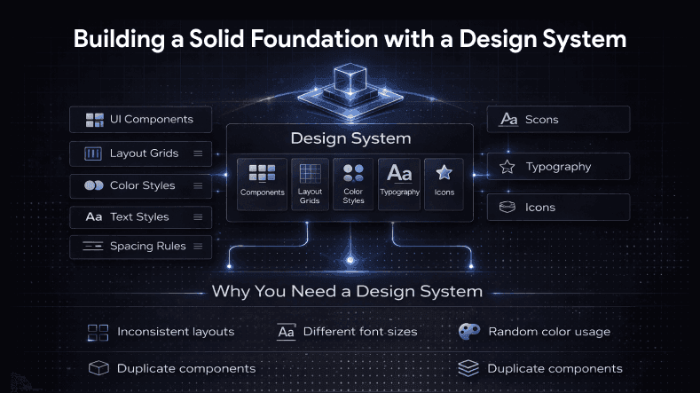
A design system is more than just components. It includes:
- UI components
- Layout grids
- Color styles
- Text styles
- Spacing rules
- Icons
- Typography
When properly structured, a design system creates a solid foundation for all your design projects.
Why You Need a Design System
If you work on multiple projects, without a design system you’ll face:
- Inconsistent layouts
- Different font sizes
- Random color usage
- Duplicate components
By organizing components inside a structured system and managing files efficiently, you maintain clarity and efficiency.
Figma component kits are regularly updated to ensure they remain current with design trends and user needs.
How to Organize Components in Figma?
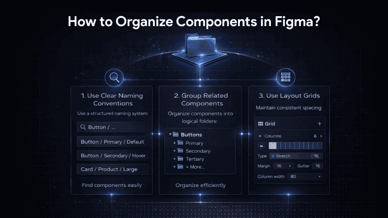
To boost your workflow, you must organize components properly. Organizing and naming layers within components is crucial for better management, as it helps maintain structure and simplifies editing.
Using clear and descriptive naming for components is essential for collaboration.
1. Use Clear Naming Conventions
Instead of naming components randomly, use a structured system:
- Button / Primary / Default
- Button / Secondary / Hover
- Card / Product / Large
This helps you quickly find the best figma components in your file.
2. Group Related Components
Organize components in folders like, for example, by surface or other logical distinctions:
- Buttons
- Forms
- Navigation
- Cards
- Modals
Separating components for different states and variations can enhance usability.
This structure supports large design projects and keeps your design process clean.
3. Use Layout Grids
Layout grids help maintain spacing consistency. They ensure your ui components align perfectly across screens.
Grid systems create balance and improve visual hierarchy in your designs.
Using Color Styles and Text Styles Effectively
Instead of manually setting colors and fonts every time, use color styles and text styles. Templates that leverage these styles allow for rapid design and consistent branding across projects.
Figma component kits can also include templates for specific use cases, such as landing pages or email marketing, making it easier to jumpstart your design process.
Color Styles
Define brand colors once:
- Primary
- Secondary
- Accent
- Background
- Error
Now, when you update a primary color, all related components update instantly.
Text Styles
Create text styles like:
- Heading 1
- Heading 2
- Body Text
- Caption
This ensures consistency across multiple projects and improves your overall design system.
Text Override: Customize Without Breaking Structure
One of the most powerful features in figma components is text override.
It allows you to:
- Change text in instances
- Personalize UI content
- Adapt components for different pages
Without affecting master components.
For example:
You can use the same card ui components on:
- Home page
- Product page
- Blog page
Each instance can have different text override while maintaining structure.
Boosting Efficiency with Variants
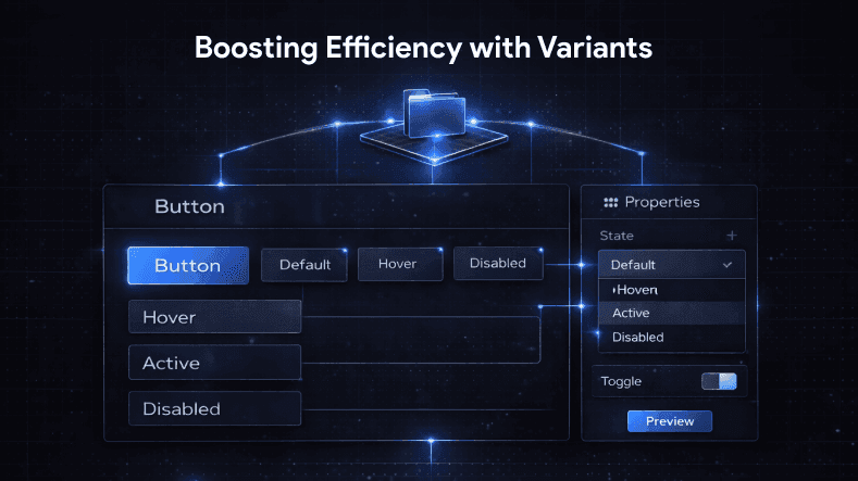
Variants allow you to combine multiple states and manage different variations of a component into one system.
Example: Button component can include:
- Default
- Hover
- Active
- Disabled
Instead of creating separate master components, variants keep everything organized.
This makes it easier to manage related components and improves the design process.
Creating a maintainable system for managing component states and variations is essential as projects grow. Using separate components for different states and variations can improve accessibility and usability.
Context Menu and Smart Editing
Figma’s context menu helps you quickly:
- Create components
- Detach instances
- Swap components
- Access properties
Right-click functionality speeds up workflow, especially when managing large design projects.
Best Figma Components to Create First
If you are starting a new project, build these ui components first:
1. Buttons
2. Input fields
3. Dropdowns
4. Cards
5. Navbar
6. Footer
7. Modals
8. Alerts
9. Tables
10. Icons
These are the best figma components that create a solid foundation for any design system.
Managing Multiple Projects Efficiently
If you’re handling multiple projects, create a shared component library that allows you to share components across different files.
Benefits:
- Save time
- Reduce repetitive work
- Maintain consistent design styles
- Improve collaboration
Figma components can be shared by publishing them, turning a file into a library for use in other documents.
Instead of recreating elements, reuse existing components across projects.
Figma vs Other Design Tools
There are many design tools in the market, but Figma stands out because:
- Cloud-based collaboration
- Real-time editing
- Component-driven workflow
- Strong design system support
While other design tools offer similar features, Figma’s flexibility and ease of organizing components make it a top choice for modern designers. Figma helps designers turn ideas into functional, organized, and user-friendly digital products by enabling them to visualize, iterate, and refine their concepts efficiently.
Figma's community regularly develops solutions, including plugins and components, to facilitate the design process.
Common Mistakes to Avoid
Even experienced designers make mistakes when working with components. Maintaining simplicity in component design is crucial, as it streamlines workflows, reduces confusion, and makes collaboration easier.
Adding descriptions to components can help users understand their intended usage.
1. Not Using Master Components Properly
Editing instances instead of master components can create inconsistency.
2. Poor Organization
If you don’t organize components, your file becomes messy and hard to manage.
3. Ignoring Layout Grids
Without layout grids, spacing becomes inconsistent.
4. Overcomplicating the Design System
Keep it simple. Follow best practices to avoid overcomplicating your design system. Start small and expand gradually.
Step-by-Step: Create a Strong Component Workflow
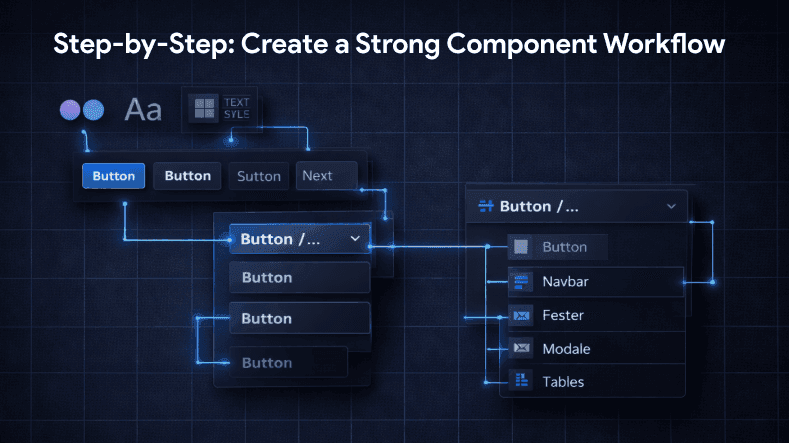
Here’s a simple strategy:
1. Define color styles and text styles
2. Set up layout grids
3. Create basic ui components
4. Convert them into master components
5. Build variants for different states
6. Organize components in folders
7. Test across multiple projects
Following this approach will streamline your design process and boost productivity.
How Components Improve Developer Handoff?
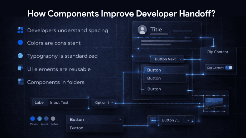
When your design system is structured:
- Developers understand spacing
- Colors are consistent
- Typography is standardized
- UI elements are reusable, including components that can extend or be resized to reveal additional content or functionality
Using clip content can help manage how elements extend outside the bounds of a component.
This reduces confusion and speeds up implementation.
Designing with Constraints
Designing with constraints in Figma is a key technique for building UI components that are both flexible and reliable. Constraints allow designers to define how components behave when resized or placed in different layouts, ensuring that elements like buttons, cards, and containers maintain their structure and appearance across a range of devices and screen sizes. By setting up constraints, you create a solid foundation for your components, making them adaptable for both desktop and mobile platforms.
Using constraints in Figma helps designers create components that automatically adjust to different frames and layouts, supporting responsive design without extra effort. This not only improves the user experience but also makes your design projects more scalable and easier to manage. Constraints also play a crucial role in accessibility, as they help maintain proper spacing, alignment, and hierarchy, making your designs more user-friendly for everyone.
Scaling for Your Next Project
Once you’ve built a structured component system, starting your next project becomes easier.
Instead of designing from scratch:
- Duplicate your file
- Reuse your collection of best figma components
- Adjust text override
- Modify color styles if needed
Figma components also allow for the creation of responsive designs that adapt to different screen sizes and devices.
This gives you a head start and saves hours of work.
Final Thoughts
If you want to boost your workflow and create professional UI designs, mastering figma components is essential. From organizing components to building a scalable design system, components help you maintain consistency, speed, and flexibility. Exploring examples of how components are used in real projects can provide practical demonstrations and help you quickly understand implementation.
The Essential UI kit includes over 100 elements that cover fundamental units seen across various interfaces.
Whether you are working on small design projects or handling multiple projects at once, having master components, related components, layout grids, color styles, and text styles in place creates a solid foundation for success.